
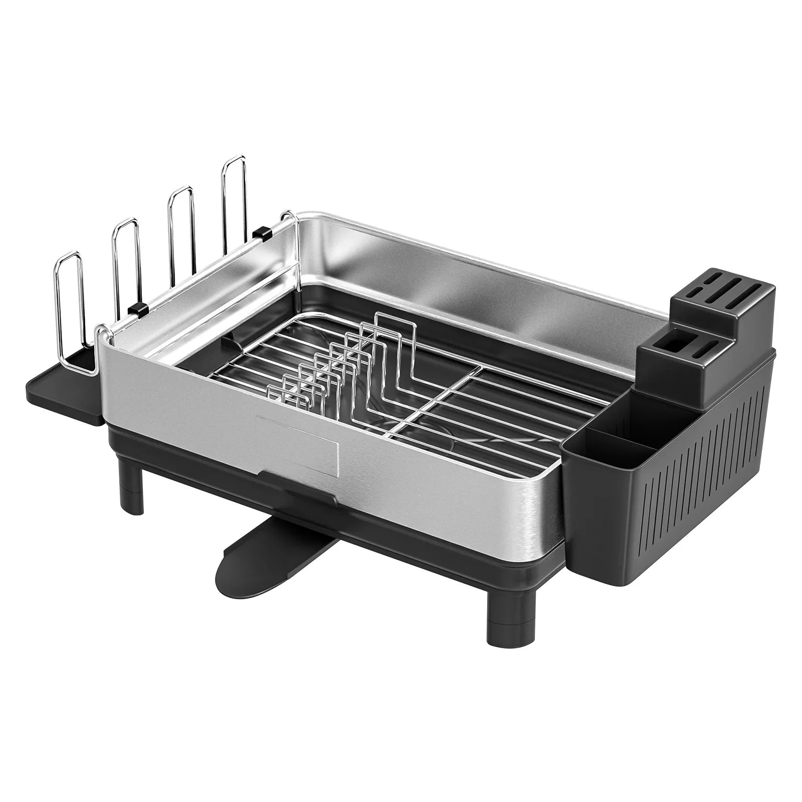
Compact Space Saving Dish Rack - with Flatware Caddy & Self Draining Tray
Sale price
£150.00
Regular price
£251.00


-45%
New
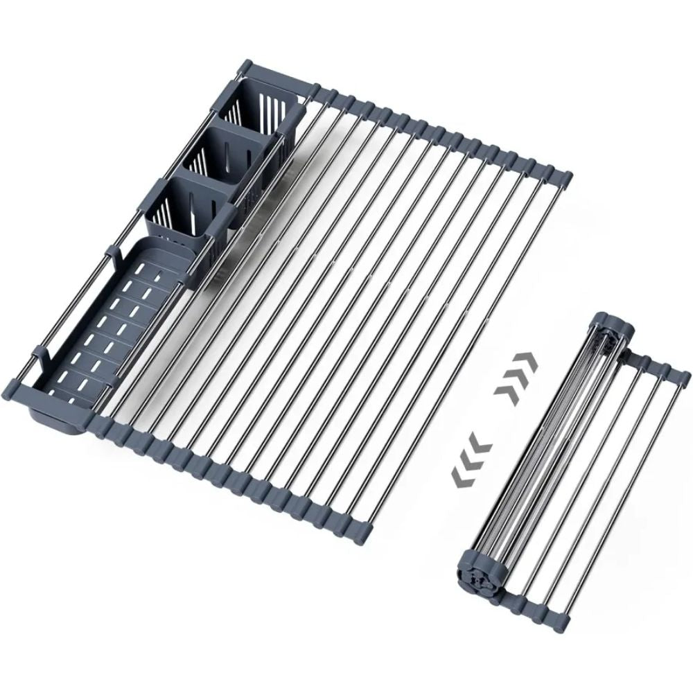
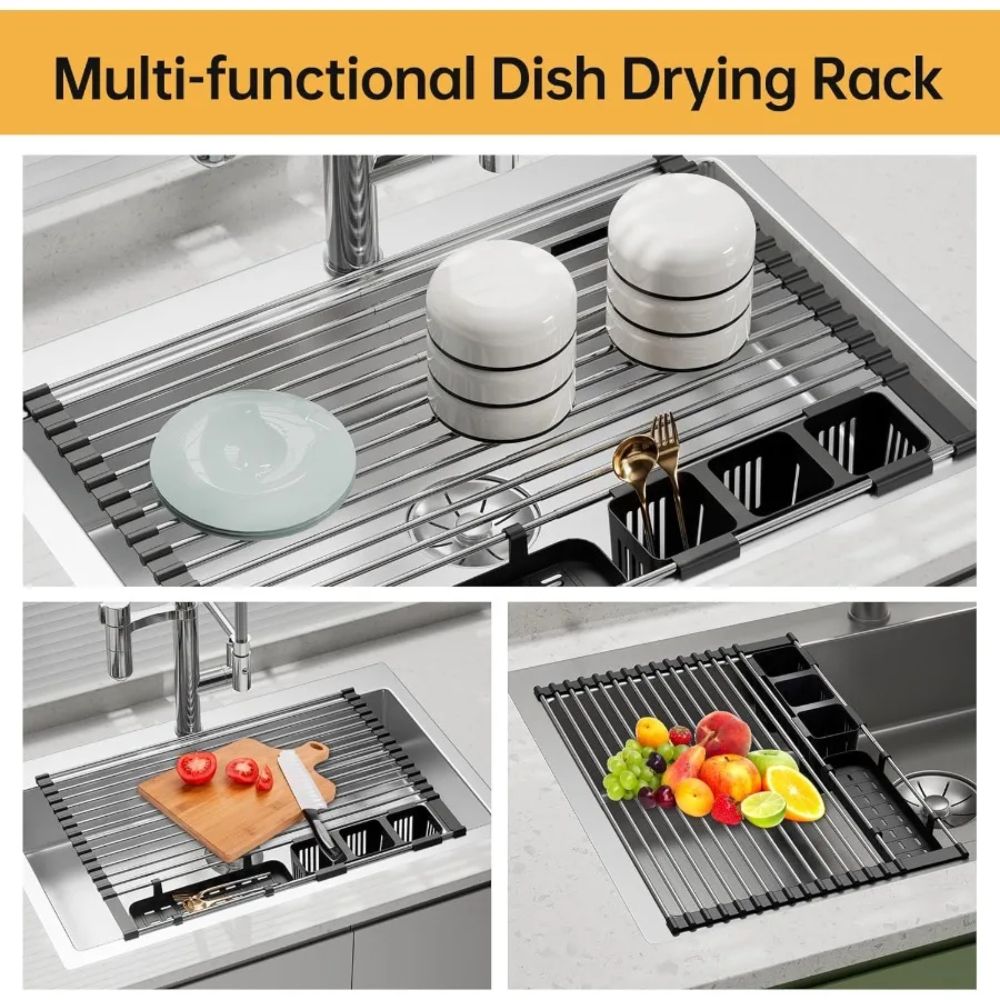
Adjustable Dish Drying Rack - Heat-Resistant and Durable
Sale price
£53.00
Regular price
£96.00
Estimate delivery times: 3-5 days International.
Use code "WELCOME15" for discount 15% on your first order.
Free shipping & returns: On all orders
Compare colors
Ask a question
Share
Couldn't load pickup availability